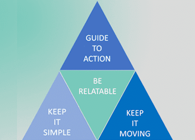
While your team may be frantically trying to create the best website, it is good to slow down and think of the website design process like a puzzle. The puzzle, in this case, is how you can implement proven design principles into your website to allow it to perform as a growth engine, provide an optimal user experience, and boost your conversion rate.
There is a surprising amount of research and literature available for website design geared towards boosting your conversion rate. The Pareto principle also tells us that eighty percent of the results come from twenty percent of the changes you will make. Let us review the 20 percent/ most critical web and landing page design tips that will boost your conversion rate and make the most impact for your business.
Keep It Simple – Make your Pages Intuitive and Easy to Navigate
One of the most fundamental pieces of advice that pops up again, is the importance of keeping your website simple. While this is critical for a number of reasons, it is certainly essential for boosting your conversion rate.
Consider the situation from the perspective of a customer who visits your website. Even if you are highly interested in the product or service, you still need to be able to navigate the page efficiently to make your purchase. If you encounter a confusing layout or an unintuitive navigation system, or, even worse, a page error, then you will have second thoughts about spending your money there. In all probability, you will look for a similar business, one of the competitors, whose pages are easier to navigate.
Confusing page layouts represent wasted opportunities. If your pages are overly complex from the point of view of a newcomer to your site, then who knows just how many sales you have missed out on?
Make your page intuitive, simple and easy to navigate. You probably know some good examples of pages that do a good job of this, but here is some inspiration to get you started. This will set you up for success in boosting your conversion rate.
Keep Things Moving – Optimize Page Load Speed
Good page design also needs to keep loading speed in mind. If your page does not load rapidly, then your customers will naturally become impatient and leave for the pages of your faster-loading competitors. Especially when it comes to loading on mobile devices, it will certainly pay off to keep things quick.
While the statistics vary greatly depending on who you ask and where you look, the general consensus is that every second counts when it comes to the loading speed of your page. For every second that your page takes to load, you will have a seven percent reduction in conversions. This is nothing to slouch over and it is important to address any loading issues with your site immediately.
Fortunately, there are many great tools available to help you check where your pages are at in terms of loading speed. Start with the easy-to-use Google PageSpeed Insights tool found here.
There are also a number of practical ways that you can boost the loading speed of your pages. Some of these are more technical than others. If you struggle with these aspects of page design, then it is recommended that you consult with a web design agency to get some answers. To start, however, you need to choose a good hosting option that suits the needs of your business, reduce the size of the images on your page, and keep the number of plugins on your page down to a reasonable level.
Once you have managed to get your page loading speed down a bit, you will certainly notice a boost to your conversion rate.
Guide Your Visitor To Take Action — Call To Action (CTA) Buttons
If you want to turn a visitor to your site into a paying customer, sometimes all you will need to do is ask. It is always a best practice to have a clear, concise and non-confusing call to action button strategically accessible on your pages. Whether you want to collect the email address of your customer or if you want to allow them to jump right into the purchasing process, a call to action button allows you to tell them precisely what is going on.
In combination with the above tips, this has a powerful effect. On a minimalist and simple webpage, you can be sure that a call to action button, in contrasting or another highly visible color that stands out immediately, will draw customers in. You can do A/B testing to optimize the placement, size, color, and message of your CTAs.
The homepage of Netflix, for example, is a beautiful example of this feature at work. On a minimalist page, notice the prominent red button staring you right in the face. If you add such a feature to your pages, with an appropriate design to match the aesthetic of your pages, then a conversion rate boost is sure to follow.
Be Relatable – Incorporate Faces Into Your Pages
As a final piece of advice, try incorporating faces onto your pages as often as possible. Visitors to your page, provided they are human, identify with the image of a human face. Simply having such an image on your site can make your business and brand more relatable and trustworthy. While these are more abstract and emotion-based considerations rather than purely technical factors, they will go a long way towards boosting your conversion rate.
Solve This Simple Puzzle And Boost Your Conversion Rate!
Following the tips outlined here will give you a noticeable boost in your conversion rate. Fiddling with the details is both a science and an art, so be patient. While the specific factors that will go into making your conversion rate higher will differ depending on the nature of your business, these best practices will work for any business in any industry.Get in touch with our team at Mikesell Digital Consulting today and let us help you to get the boost you need.


