As a business owner, being dialed into the pulse of the latest developments and changes in every facet of your business allows you to thrive in your niche. Finding the time to keep tabs on these trends can be tricky, especially when you are balancing the many demands that each day throws at you. To succeed, it can be useful to narrow your focus down to a few key areas that will have the biggest impact. Following up-to-date web design trends, for example, will give you an opportunity to imagine and present an online presence that will remain strong, attract more prospects, and create a productive user experience.
Take control of your web design this year! Work on implementing a few of the most powerful features that are going to actually make a big difference in the coming months and leave your visitors with a distinctive experience.
Here are a few specific web design trends that you want to checkout for your website in 2020.
Minimalistic Design
While minimalism has always been important to a certain percentage of business websites, you can expect to see a big shift in this direction throughout the coming year. This is a welcome wake-up call for business pages that are overly cluttered, aesthetically confusing and difficult to navigate.
Not only does a minimalist website design keep your web interface looking crisp and sharp, but it also brings highly functional benefits as well. By simplifying your business pages, you can expect that your customers will have an easier time getting around your site. This will organically lead to a higher conversion rate, as your customers will not get lost in the details when they are trying to buy your products or services.
Fundamentally, however, minimalist web design simply looks great. In terms of principles to keep in mind, think of monochromatic color palates and maximized negative space. If you want to take things to the next level, you can also get creative with the font you choose for maximum impact.
Adopting this kind of design philosophy will allow you to highlight what is truly important about your business and scrap the rest. There are many excellent examples of business pages that have already adopted this web design trend, as well. If you need some inspiration, try looking through some of the templates here.
Retro & Modern Blend
Another web design trend that you need to consider this year is bringing back a retro look to your pages. Either by itself or in combination with the minimalistic design, retro features such as monochromatic photos and old-fashioned aesthetics will bring something new to your site.
However, not all retro designs can be lumped into a single pile. Try to keep things consistent. Pick a decade and base your website on the notable features of that era. For example, if you are looking for a throwback to the 1980s, think about bright neon color palates and the increasingly popular “synth-wave” aesthetic.
Depending on the products and services that you offer your customers, you can even consider going way back to the early 1900s in your design philosophy. Old-fashioned fonts fit with a number of products. For example, you might usually see such designs prominently used with men’s barbershops these days.
If you are thinking about going retro with your web design this year, then be sure to keep things consistent. While it will pay off to have a website that combines the best aspects of retro and modern, a confusing blend of the two can potentially be disastrous. Use these tips to help you get it right!
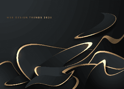
Dark Mode Web Designs
Something that continues to pop up in the web design literature these days is the rise of the dark mode design. Do not be thrown off by the sinister-sounding terminology as this is expected to be increasingly popular in the coming year.
Dark mode designs simply dial down the color palette of your site. By making the different components of your pages various shades of black and gray, you can make your pages easier on the eyes and easier on the battery life of your customers. This is a bold statement to make, as it will definitely bring a different tone to your pages, though it is usually only used as an alternative to the “light mode” of your page design.
Since web design applied to this aspect of a site is relatively new terrain, there is not much in the way of best practices to follow here. This makes it both an exciting opportunity for enterprising entrepreneurs and a great way to learn more about web design skills. Check out this page for some basic tips on bringing your dark mode design to life.
Use These Website Design Trends To Your Advantage
It is still early in the year to make big changes in your web design. If you want to capitalize on these insights and receive the early-adopter benefits of knowing things before others, then get to work on implementing these web design trends in a way that enriches and elevates your website. Go ahead and challenge your designer to innovate and inspirce.
Taking the time to do this carefully and remaining true to your brand will provide you with a host of benefits and advantages. From higher conversion rates to an enhanced reputation through better design, contact our web design experts at Mikesell Digital Consulting to update your business website for the new year.


